Wednesday, April 17, 2024

MOODY ARTISTICALLY INKED

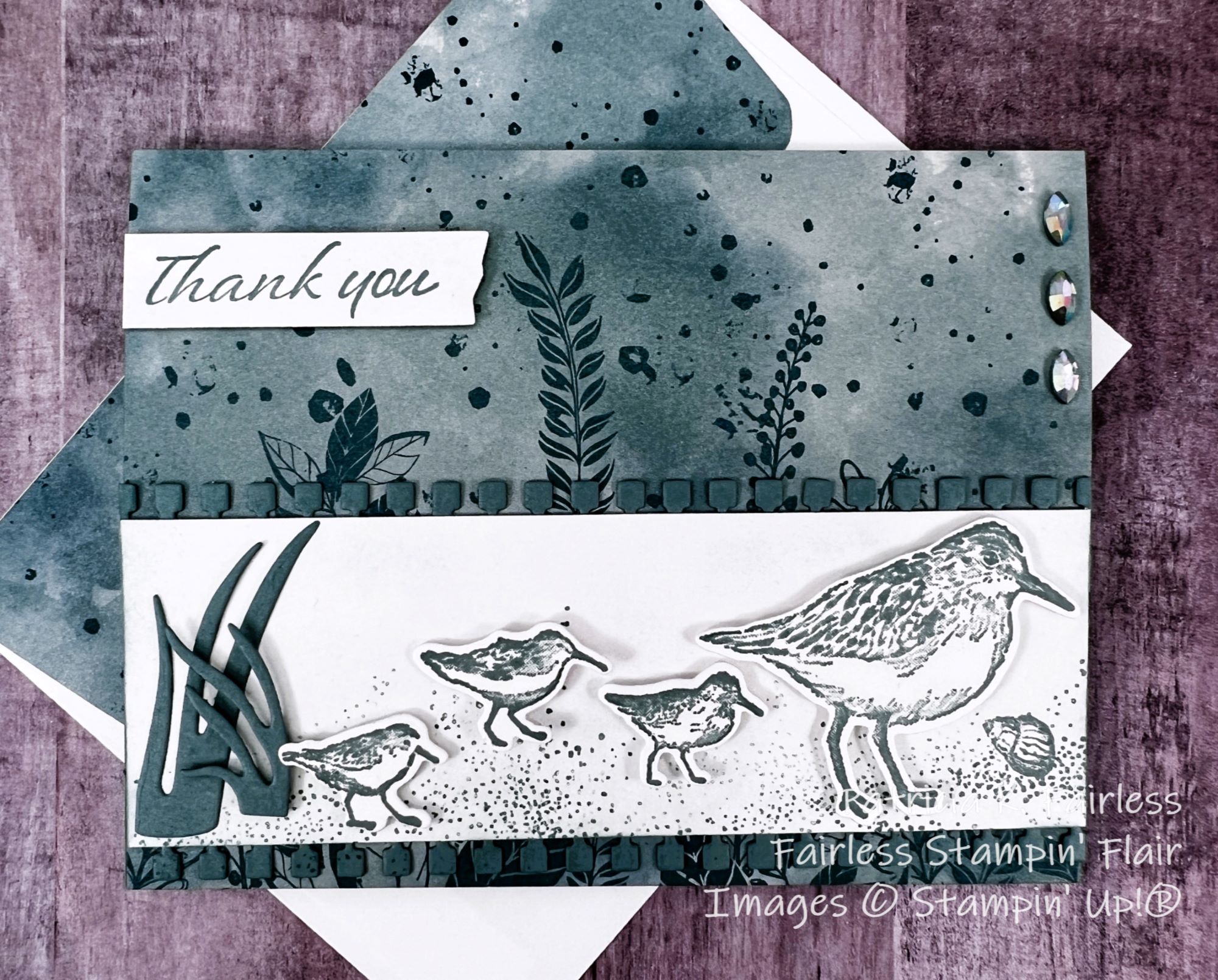
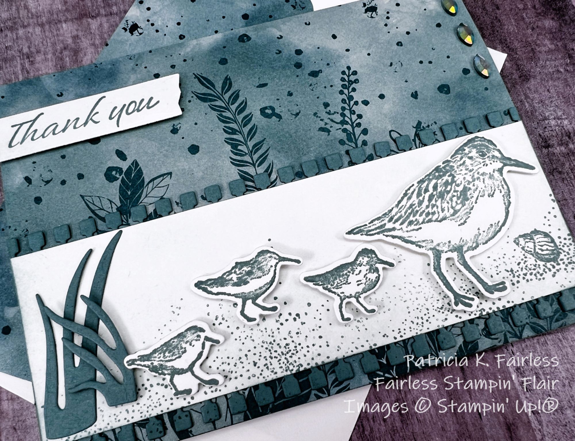
The Artistically Inked stamp set and dies have been around for a couple of years, and it has been one of my favorites since I first laid eyes on it.  The stamps make beautiful DisINKtive images.


Today's card layers the two largest flowers stamped with Moody Mauve ink.  Don't those DisINKtive stamps give a lot of dimension to the flowers?  You can almost feel the petals!

Because there are coordinating dies, this was a quick and easy card to make.

The Bubble Bath panel on the left of the card front was embossed with the Distressed Tile embossing folder and then bordered with a little strip of Moody Mauve cardstock.  The Artistic Dies include the large leafy stem.  The Basic White stem die cut provides texture to the right side of the card front.

The leaves around the flower were stamped with Blackberry Bliss and quickly die cut with coordinating dies.  The three small Moody Mauve flowers are made with a single stamp and die.  All flowers were given a coat of Wink of Stella to add shimmer.

Iridescent Rhinestones were added to the center of each flower to add a bit more sparkle.

This semi-monochromatic card is MUCH more elegant in person.  The photos just do not do justice to all the pretty shimmer.


I did not add a sentiment on the inside of the card at this time, but I can always add one later once I know how it will be used.  The inside sentiment layer was double matted with Moody Mauve and Bubble Bath cardstock and then several of the little flowers were stamped in the corner with Moody Mauve.

You can use this link to download a free tutorial.

A list of products used is shown below.  Click on any image to purchase a favorite or learn more about that product.


Product List

Monday, April 15, 2024

WALKING BY THE SEASIDE BAY

Since we are in the process of saying goodbye to some products in the 2023-2024 Annual Catalog, I have decided to spend the next couple of weeks saying farewell to some of my favorites.

I have always loved anything related to the water -- whether it is a beautiful lake like the one I enjoy every day, or walking along a sandy shore, or just sitting and listening to the waves roll in.  So, when Seaside Bay was first introduced, it was a bundle I purchased immediately.  As we now make room for new products, we need to say goodbye to this old favorite.

Our Coffee Club challenge this month was to make a monochromatic card.  This was my 2nd attempt, and I think it achieved monochromatism much better than my first attempt.

Color selection is always a challenge for me so when starting a project I usually pull out my color coach or start with the colors in designer series paper (DSP).  This DSP is from the Hello, Irresistible collection which is an ONLINE EXCLUSIVE.  

I thought this particular pattern of DSP was appropriate to use with the Seaside Bay stamp set.  It reminded me of seaweed floating in bubbly water.  I'm just glad I'm not swimming in it.  I hate the feel of weeds rubbing against my legs when swimming.

All stamping on this card was done with Lost Lagoon ink.  I used a Blender Pen to spread the ink just a bit on the birds feathers and then added some Wink of Stella to add a little sparkle.


The border along the top and bottom the Basic White strip was made with a die from Gorgeously Made Dies.  

I used the opposite edge from the die cuts to border the DSP decorative strip on the inside of the card.  This way, nothing went to waste!


The DSP strip is wider than I normally use for the inside of a card, but I wanted to show as much of the "seaweed" as I could.  There is still plenty of room for a handwritten thank you note.

Use this link to download a tutorial with all the cutting dimensions and step-by-step assembly instructions.

Refer to the product list below for items used on this card.  As I indicated above, Seaside Bay is on the Last Chance List.  The stamp set is 50% off and the dies are 60% off!


Product List

Friday, April 12, 2024

IT'S A GOOD DAY

I hope you woke up this morning and decided it is a good day to have a good day!

For my last Filled with Happiness card this week, I have a simple Front Flap Fun Fold to share.


It's basically just a little card on top of the full size card.  Two cards in one, or a twofer!

This image is the third image sentiment in the Filled with Happiness Stamp set and might be my favorite one.  I'm not typically drawn to fruit images, but I love the sentiment itself.  I believe we can control much of our daily "moods" by making a conscious decision when we get up in the morning that "today is going to be a good day!"  It may not be a perfect day, but it is much more likely to be a good day when I start it with a positive attitude.

Since there was a fruit image on the stamp, I decided that these were going to be lemons.  Not because they particularly look like lemons (wrong shape), but because I liked the colors on this designer series paper pattern from Delightfully Eclectic.  And this paper looks like lemons.  All the rest is creative license (or my imagination)!

This DSP pattern has Bubble Bath stripes with Daffodil Delight, Crushed Curry and Bubble Bath "lemons".  They must use Bubble Bath lemons to make Pink Lemonade -- my favorite!  Since the lemons have Garden Green leaves, I started with a Garden Green card base, a color I don't use often except at Christmas.

The scalloped Bubble Bath Shimmer paper was die cut with the Scallop Contours Dies.  Sadly these are on the Last Chance List, but happily, they are 30% off.  These dies have been around for a while and I was not surprised to see that they were retiring.  If you don't already have them, you should consider purchasing them.  They are awesome!

Since there are two cards in one, that means there are also two card insides to decorate.

I decided to make the card so it could be used for any occasion.  The simple hello from filled With Happiness on the inside of the little card keeps that portion of the card generic.  I masked the "miss you" portion of the stamp to purposely keep it generic.


And leaving the inside of the main card sentiment-free allows me to make it whatever I want it to be when the need arises.

Use this link to download a FREE TUTORIAL that includes all cutting and scoring dimensions as well as step-by-step assembly directions.

The product list below summarizes the products I used.

Product List

Wednesday, April 10, 2024

SENDING A QUICK NOTE

The card I'm sharing today has a very modern feel to it.  I'm not sure if it is the colors, the patterns or the overall design.  What do you think?  Do you see "modern" when you look at this card?


I'm still trying to decide if I really like it.  Modern is definitely the home decor style that I like.  I am all about a clean and simple style when it comes to my surroundings.  But I'm still debating about this card.


As I began designing the card, my first goal was to use the Delightfully Eclectic Designer Series Paper (DSP). This DSP is the large DSP collection in the current Annual Catalog.  I had not purchased it, but then when it was added as a choice in month 2 of Sale-A-Bration I thought, “What do I have to lose?  It’s FREE!”

I have always been drawn to the color combination of Black and White with a dash of red.  I considered using that color combination for this card.  But I thought I should get out of my rut and try something different.  So, the accent color I choose was Tahitian Tide which is one of the retiring In-Colors.

Most bright colors will look nice with black and white, but what are your thoughts about this color combination?  

Of the three sentiment image stamps included in the Filled with Happiness set, this one is definitely the most modern (clean & simple).  During my research I saw a card where someone had emphasized the "just a note" portion of the image, so I thought I would emboss the words on Basic Black Cardstock with white embossing powder.   I think that was a good option for this image.  It's bold and stands up to the boldness of the DSP patterns.


Since the sentiment says, "just a note", I thought I should leave plenty of room inside the card to write a personalized "note".  I stayed with the modern feel by matting the message layer with Basic Black and Tahitian Tide cardstock and then adding a strip of one of the bold DSP patterns from the front.  I tried the swans first because I thought they were cute, but they didn't stand up to the boldness and modern vibe of the rest of the card.  I settled with using them on the envelop flap.  Can you see the sneak peak?

Use this link to download the PDF Tutorial for today's card.

Refer to the Product List below for more information on any of the products used.

Product List